The field names should not contain spaces. The Field_type can be only of two types: STRING (string of text) and FLOAT (numerical). The Field_class and Field_description are optional, they also should not contain spaces. For this tutorial, we prepared a file containing data about gain/loss in the minimal regions of CGH profiles done on a collection of tumor samples. Below you can see how the sample.dat file looks in the beginning:<number_of_columns> <number_of_rows> <Field1_name> <Field1_type> [<Field1_class>] [<Field1_description>] <Field2_name> <Field2_type> [<Field2_class>] [<Field2_description>] ... <Fieldn_name> <Fieldn_type> [<Fieldn_class>] [<Fieldn_description>]
This means that the data table contains of 319 columns (there are 316 minimal regions and 3 columns with names, clinical class and description of a sample) and 34 rows (samples). The numbers in this table are only -1,0 and 1 that means gain, no change and loss of a minimal region in the corresponding CGH profile. Every minimal region is characterized by chromosome in which it is located and, more precisely, by a standard genetic map index (we could also include the information about the genes located in this region). Presence of three string fields, NAME, CLASS and DESCRIPTION is desirable but not necessary condition to use the applet, because it will try to take the information specifically from these fields to annotate the points. If no NAME field is provided then the applet will take the value from the first field of STRING type. It is preferrable to save the data table you prepared in a file with .dat extension.319 34 NAME STRING CLASS STRING DESCRIPTION STRING REG0 FLOAT CHR1 1p36.3 REG1 FLOAT CHR1 1p36.2 .... REG313 FLOAT CHR21 21q22 REG314 FLOAT CHR22 22q13 REG315 FLOAT CHR22 22q13 Smpl1 "C2" "" 1 0 0 0 0 0 0 0 0 0 0 0 0 -1 0 0 -1 0 0 0 -1 0 0 0 -1 0 -1 0 -1 -1 0 -1 0 -1 0 -1 0 0 0 -1 0 -1 0 0 0 0 0 0 -1 0 -1 -1 0 -1 0 -1 -1 -1 -1 0 -1 -1 -1 0 -1 0 -1 0 0 -1 -1 0 0 1 1 1 1 0 1 0 1 0 1 0 0 1 0 0 0 0 1 0 1 0 0 1 1 0 1 1 1 0 0 1 1 0 1 0 0 0 0 0 0 0 0 0 0 0 0 0 0 0 1 0 1 0 1 1 1 0 1 1 1 1 1 1 1 0 0 0 0 0 0 0 0 0 0 0 0 0 0 0 0 0 0 0 -1 0 -1 0 0 -1 0 1 1 0 1 0 -1 -1 0 -1 0 -1 -1 -1 0 -1 0 0 0 0 -1 0 0 0 0 -1 0 0 -1 -1 0 0 -1 0 0 0 0 -1 0 0 0 0 0 0 0 0 0 0 0 0 -1 0 0 0 0 0 -1 0 -1 0 0 0 -1 0 0 -1 0 -1 0 0 -1 -1 -1 0 0 0 0 0 0 0 0 0 0 0 0 -1 0 0 -1 0 0 0 -1 0 -1 0 0 -1 -1 -1 0 0 0 0 0 0 0 0 -1 0 -1 0 -1 0 -1 -1 0 -1 -1 0 0 -1 0 -1 0 0 1 0 0 0 0 -1 -1 0 -1 0 -1 0 -1 0 0 0 0 -1 0 1 0 1 0 0 0 0 0 0 Smpl2 "C4" "" 0 -1 -1 0 -1 0 -1 0 0 0 0 0 0 -1 0 0 -1 0 0 0 -1 0 0 0 0 0 0 0 0 0 0 0 0 0 0 0 0 0 0 0 0 0 0 0 0 0 0 0 0 0 0 0 0 0 0 0 0 0 0 0 0 0 0 0 0 0 0 0 0 0 0 0 0 0 0 0 0 0 0 0 0 0 0 0 0 0 0 0 0 0 0 0 0 0 0 0 0 0 0 0 0 -1 -1 0 0 -1 0 0 -1 0 0 0 0 0 0 0 0 0 0 0 0 0 0 0 0 0 0 0 0 0 0 0 0 0 0 0 0 0 0 0 0 0 0 0 0 0 0 1 0 1 0 1 0 0 1 0 -1 0 -1 0 0 -1 0 0 0 -1 0 -1 -1 -1 0 -1 0 -1 -1 -1 0 -1 0 0 0 0 0 0 0 0 0 0 0 0 0 -1 0 0 -1 0 0 0 0 0 0 0 0 0 0 0 0 0 0 0 0 0 0 0 0 0 0 0 0 0 -1 0 0 0 -1 0 0 -1 0 -1 0 0 -1 -1 -1 0 0 -1 0 0 0 -1 0 0 0 0 0 -1 0 0 0 0 0 0 -1 0 -1 0 0 -1 -1 -1 0 -1 0 0 0 0 0 0 0 0 0 0 0 0 0 0 0 0 0 0 0 0 0 0 0 1 0 -1 0 0 0 -1 0 0 0 0 0 0 0 0 0 0 0 0 -1 0 -1 0 0 0 0 0 0 -1 ....
There are several parameters: datfile is the URL of the .dat file you have prepared at the previous step, settings_file is the URL of a settings file for the elmap algorithm. If you have Internet connection, you may not to change the settings_file parameter, it will be downloaded from the specified remote location. If you plan to work without an Internet connection then you should download the elmap.ini file and specify a location by ising "local" URL like below:<html> <head> <title> HTML Test Page </title> </head> <body> <br> <center> <applet codebase = "." code = "vdaoengine.TestApplet.class" name = "TestApplet" archive = "VDAOEngine.jar" width = "500" height = "500" hspace = "0" vspace = "0" align = "middle" > <param name = "datfile" value = "http://www.ihes.fr/~zinovyev/test/sample.dat"> <param name = "settings_file" value = "http://www.ihes.fr/~zinovyev/test/elmap.ini"> <param name = "microarray_type" value = "CGH_minimal_regions_gain_loss"> </applet> </center> </body> </html>
The microarray_type parameter is used to specify the type of the microarray and is used to modify the applet behaviour. For the moment the following types are supported:<param name = "datfile" value = "file:///c:/datas/myfile.dat"> <param name = "settings_file" value = "file:///c:/datas/settings/elmap.ini">
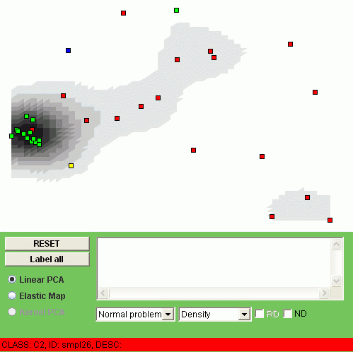
The points corresponding to different values of the CLASS field will be automatically colored in different colors. The grey coloring in the background corresponds to a simple continuous estimation of the point density. You can browse the image with mouse cursor and in the status line you will see the NAME, CLASS and description of the object you point at:

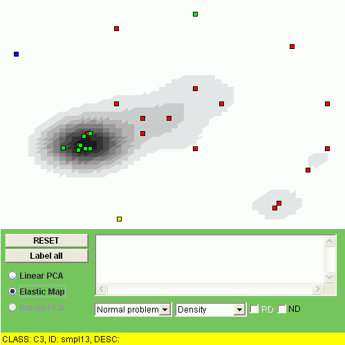
If you click on the point then the NAME field will be drawed on the image and the DESCRIPTION field will appear in the text box. You can also click "Label all" button to put all the point NAME labels or click "RESET" button to clear them. To apply the elmap algorithm, click Elastic Map radiobutton. The construction of the map can take some time. It takes several seconds to construct the map for a table with several hundreds of rows and several tens of columns, but if you have a big table then it takes more time (the time is more or less proportional to the number of elements in the table). In our sample we should have the result in a couple of seconds:
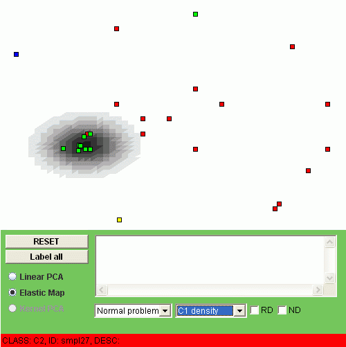
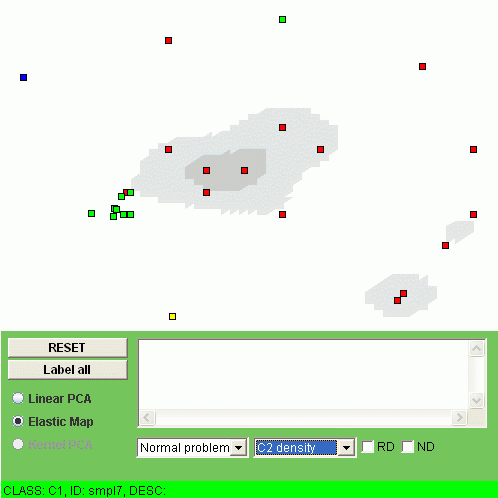
Another possibility is to visualize the "relative density" of a class, i.e. the relation of the class density and the overall density. To do this, one should click "RD" checkbox. For example, the relative densities of class "C1" and class "C2" look as follows:
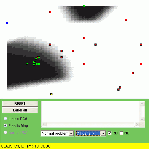
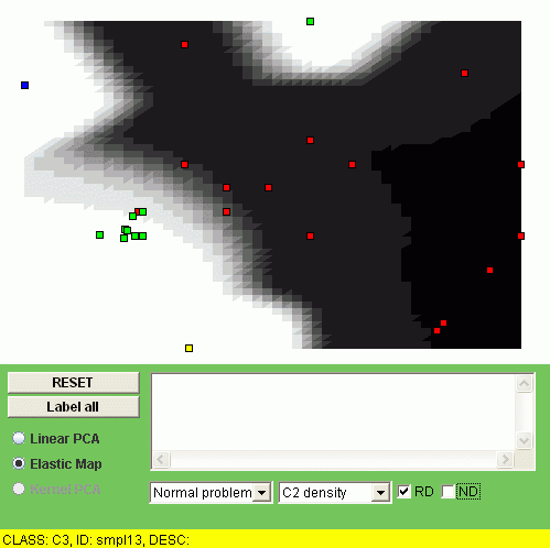
The interpretation of the relative density is that the points of some class are overrepresented (or underrepresented) in a region of the map.
The applet shows these linear (PCA) and non-linear (elastic maps) manifolds "unfolded", in their internal coordinates. But every point of a manifold is a point in multi-dimensional space (since it is embedded and constructed there). Thus we can visualize values of a function defined in multidimensional space, in the points of the manifold. Since we construct a smooth manifold, then the values of a smooth function will remain smooth in the points of the manifold.
The simplest function we want to visualize is simply a coordinate value. We will have m such visualizations where m is the dimension of the data space. For example, below you see linear and non-linear visualization of the REG3 (minimal region, number 3) value:
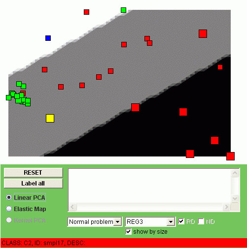
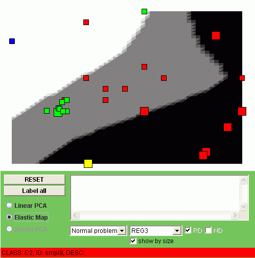
We call these type of the visualization "a smoothed trend". To understand this notion, notice that you can show the value of REG3 for the data points by enabling the "Show by size" checkbox. Then the points with gained value (+1) will become big, the points with lost value (-1) will become small. The color of the background also corresponds to the gained (black), normal (grey) or lost (white) value, but in the points of the manifold (after some thresholding, of course). In fact, what you see is the smooth tendency of changing the REG3 value.
It is useful to understand that PCA and non-linear PCA can be regarded as methods of averaging. When you calculate a mean point, you minimize mean-square distance to a point. When you calculate the principal plane, you minimize mean-square distance to a plane. When you calculate the principal manifold, you again minimize the sum of the squared distances between the points and their orthogonal projections onto the manifold. Thus every coordinate becomes also averaged and you see this average on the visualization of the smoothed trend.
The second simple function one can visualize with the applet is the mean value in one class of coordinates. In this example the coordinates (minimal regions) have been divided into classes accordingly to their position on different chromosomes. Thus we have 22 classes, one per chromosome. Below, for example you can see the non-linear visualization of the CHR2 class:
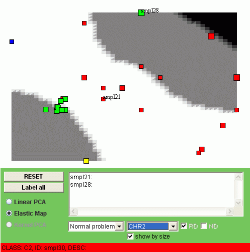
Again, if you mark on "Show by size" checkbox then the average gain-loss value for every point will be shown by size. For example, one can see that sample 28 has considerable duplications in the second chromosome whereas sample 21 has some deletions. Most of the points (with one exception) of the class C1 (the green ones) do not have significant changes in the second chromosome.
In the "transposed" problem, we turn the table by 90 degrees such that every row now corresponds to a minimal region and every column corresponds to a sample. Thus on the PCA plot every point is now a minimal region and the samples (or classes of samples) are visualized as smoothed trends.
Change the type of the problem from "Normal" to "Transposed" in the combobox, and, for linear PCA, one has the following image:
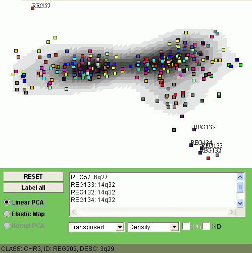
The explanation of the image is the following. Those points (minimap regions) which are close to the "kernel" of the distribution are less changed in average. On the image above you can see, for example, that REG57 (locus 6q27) and REG132-134 (all three are from locus 14q32) are frequently alternated in this set of samples.
Now let us swith to the non-linear visualization of the transposed problem:
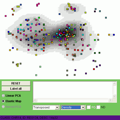
This non-linear visualization gives us a more detailed picture of alternations.
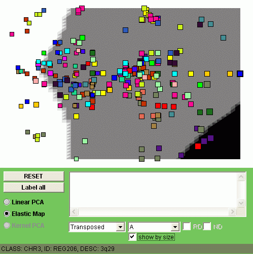
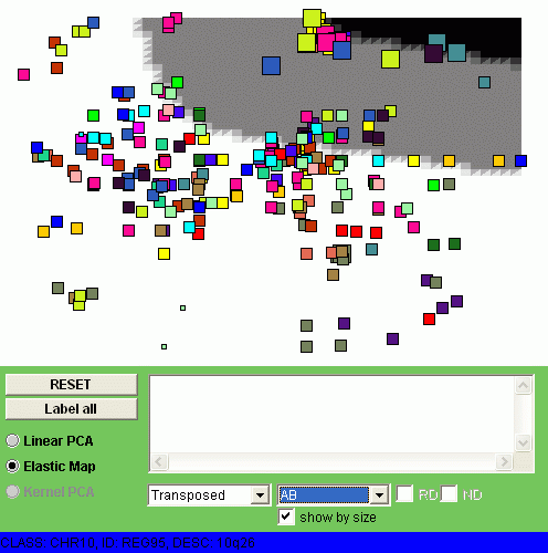
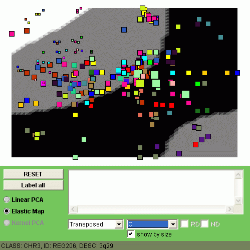
Now let us visualize by coloring all four classes of samples (C1, C2, C3 and C4).
The size of the points denotes here the expression level of a minimal region
in one class of samples, averaged.
You can observe different patterns of genome alterantions:
 | 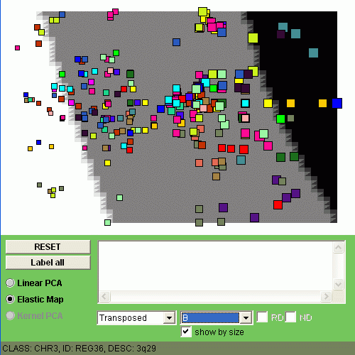 |
| CLASS C1 | CLASS C2 |
 |  |
| CLASS C3 | CLASS C4 |